Let’s resume the introduction to the widgets series. We will take a look at the Image widget in this post.
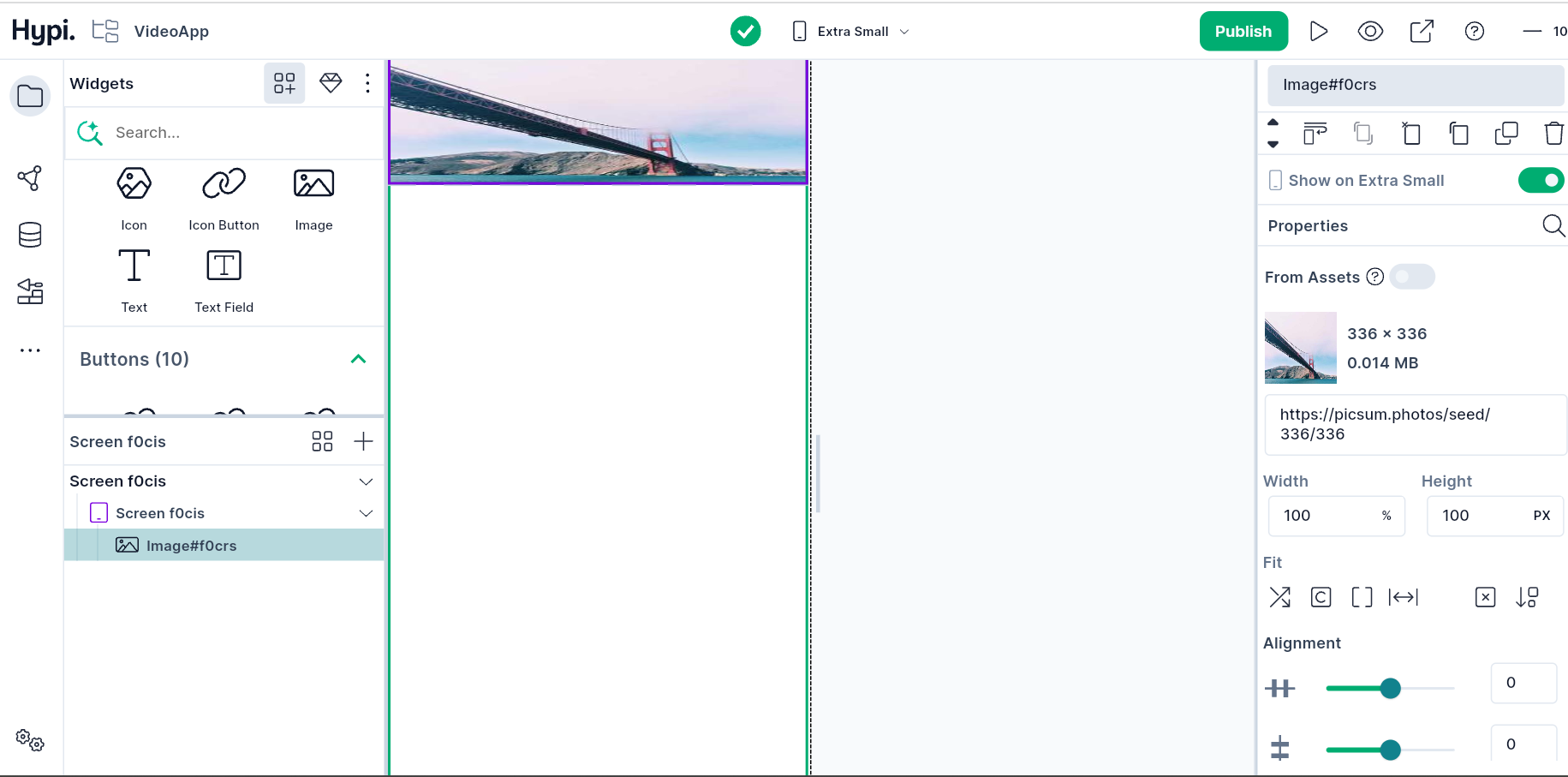
Image is a common widget that displays an image. Images are required in most applications. They can be uploaded from a URL or an asset.
Let’s check the properties of the Image widget…
Enter the web url of the image here. The image gets uploaded automatically.
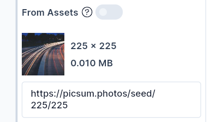
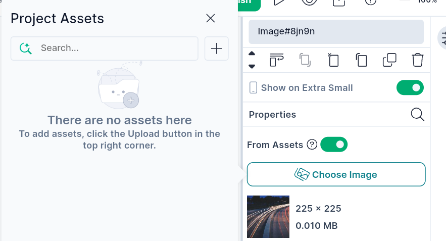
Alternatively, you can upload an asset to use as an Image.
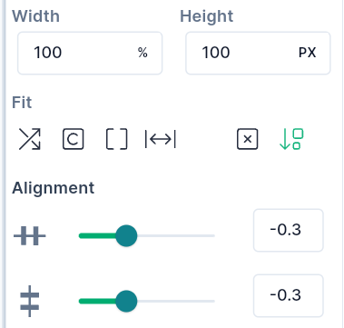
- Set the width and height of the Image widget.
- You can fit the Image within the prescribed dimensions using Fit Options. Fit options are described here.
- You can also move the widgets horizontally or vertically using a slider.
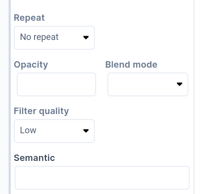
- You can repeat the image horizontally or vertically using the Repeat option. The image gets repeated within the prescribed widget dimension.
- The transparency of the Image can be controlled by providing an Opacity value.
- BlendModes are described here
- If there is a misalignment between screen pixels and image pixels, we need to render an image using filter quality.
- The description of the image can be given as Semantic Label.
We will see more Tink widgets in future posts.
You may also check out Flutter Image widget below.
Disclaimer: The attached video is from @Flutter who is not associated with Hypi.